Architect Suchi Reddy and I have been friends for more than a decade. She lives in New York, the founder of Reddymade studio; I live in India. I joke that I follow her work around the world. In 2023, we met in Dhaka during the art summit, where she presented the installation Between Earth and Sky. Then in December 2024, in Mumbai, when she unveiled Chromacosm, an installation created in collaboration with Asian Paints to celebrate the launch of the brand’s Chromacosm colour library — the world’s largest architectural paint system featuring more than 5,300 shades. We then met about a month later in Mumbai at the debut of the Architecture and Design Film Festival, where Chromacosm was showcased again.
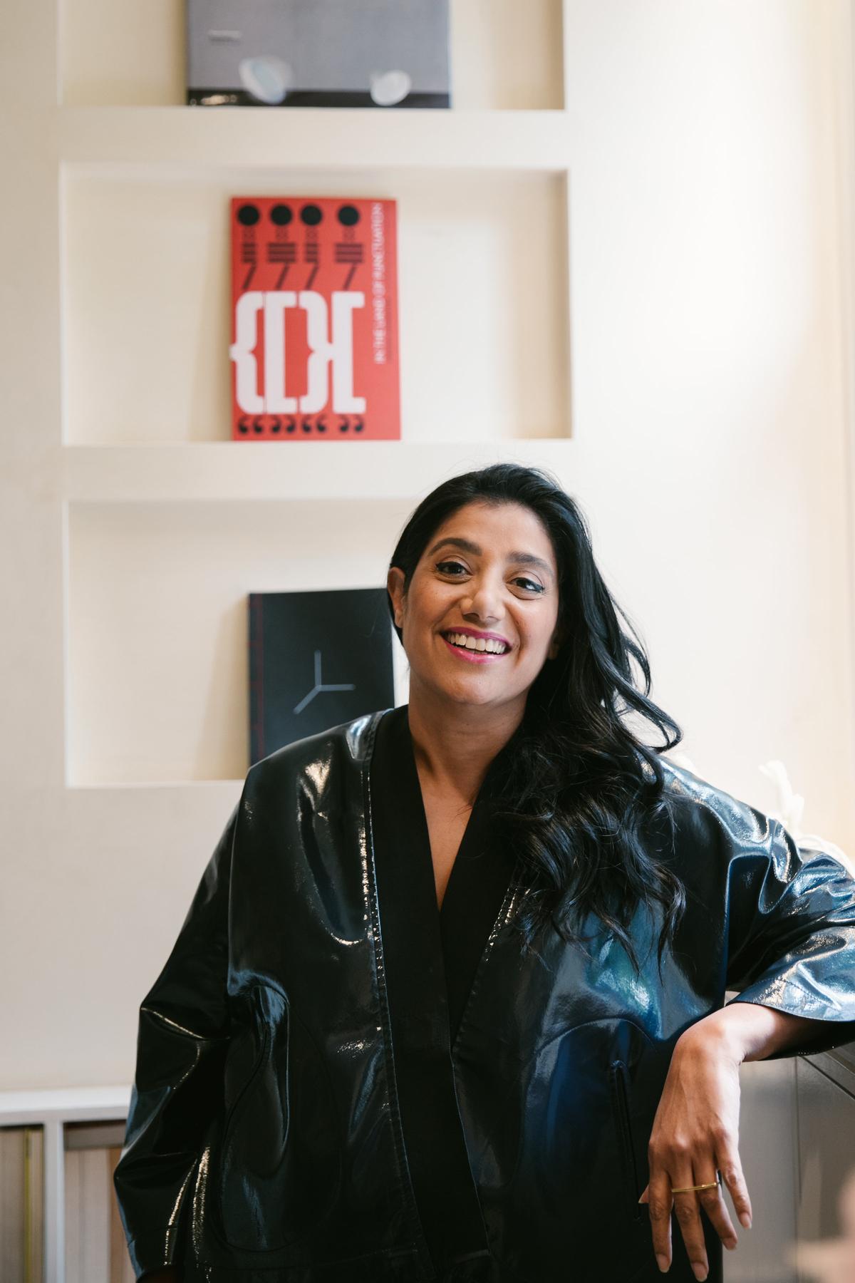
Suchi Reddy
| Photo Credit:
Chloe Horseman
It was during this last meeting, over dinner at the Vetro in Oberoi Hotel, that she asked me: “When was the last time you felt a sense of belonging?” What ensued was a conversation about family, community, friendship and making place for oneself in the world. Bias and Belonging — the former a way to ‘other’, the latter, a possessive — was also the name of a large community project she presented at the Colgate University in upstate New York in April. The exhibit contained woven, textual and digital elements representing what she’d learned from community conversations with students, faculty and staff. It is the typical approach of this Chennai-born architect. She likes stories, she wants to understand, she’s an intent listener, a watcher.
Reddymade has an impressive list of clients — from high-end homes to brands such as Google and Humanscale. The most recent of her many public installations is Turbulence 2025 for the Brooklyn Botanic Garden where she used research on plant acoustics to create an interactive installation comprised of reflective metal panels serenaded by a haunting ethereal soundscape. In early September, Reddy will present Patterns of Protection, a spatial response to the curatorial brief at the debut edition of the Bukhara Biennial.
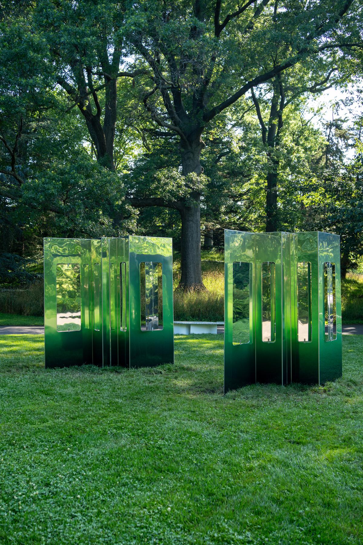
Turbulence 2025 for the Brooklyn Botanic Garden
There is a common element of empathy that runs through all of Reddy’s works, whether private or public. For years now, the primary focus of her work has revolved around neuroaesthetics, exploring how spaces can be orchestrated to influence the occupants’ feelings. In a conversation shortly before her Bukhara trip, she speaks about her work and its evolution:

How does your Indian heritage find its way into your practice?
The sensuality and sophistication of the South Indian aesthetic sensibility is deep in my design DNA. The beautiful light transitions in our layered traditional architecture, the simple, minimal material transitions, the texture in our crafts, the luxuriousness of our textiles, and the fragrance of our flowers all find expression in my work — whether it’s architecture, interiors, objects, or art.
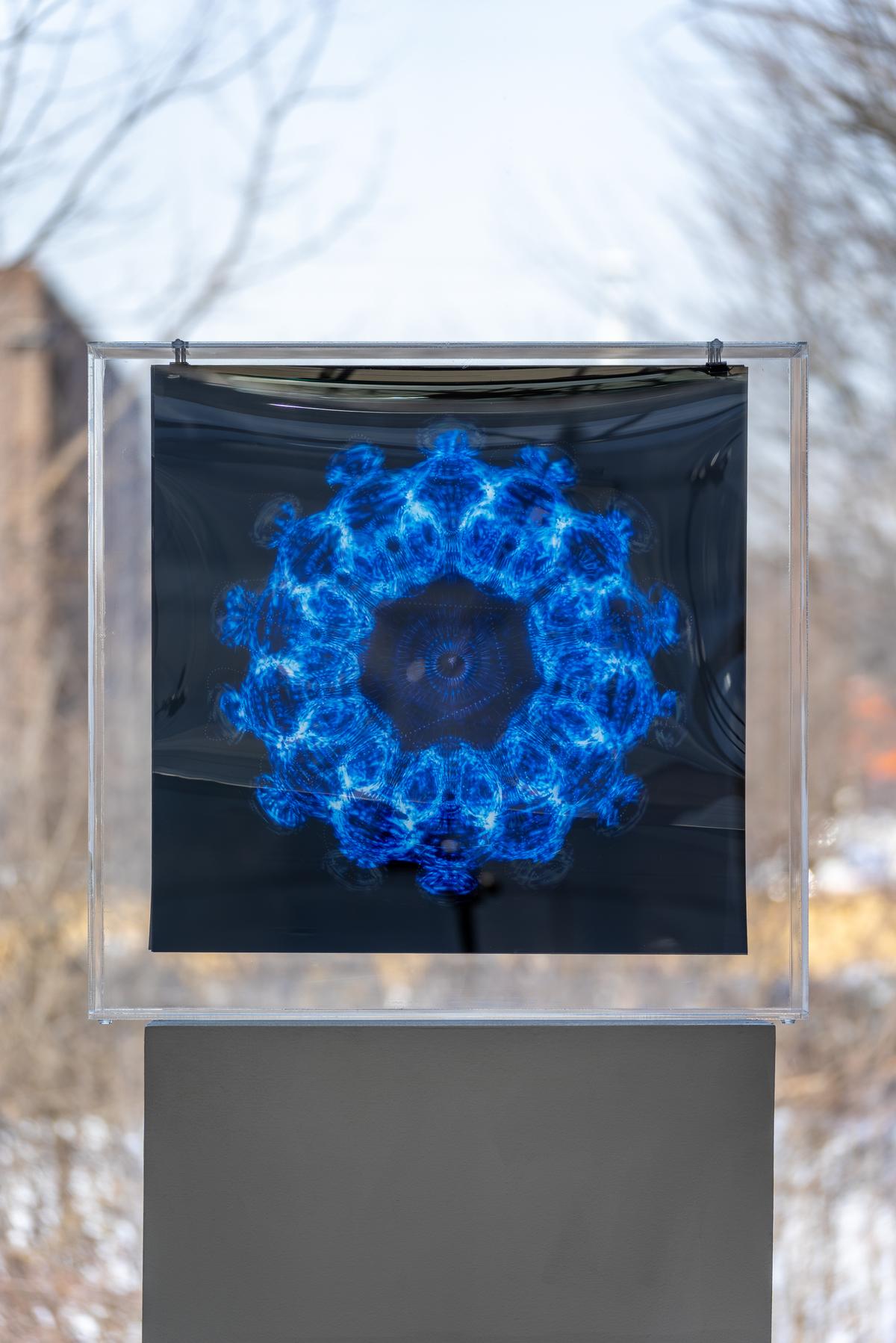
Autophysiopsychopoetic (2024)
| Photo Credit:
Siegfried Mueller Photography
How has your parents’ Chennai home, and your mother’s relationship with colour, impacted your work?
I owe my design chops to my mother. She came from a small village in Andhra Pradesh, never went to school, but mastered six languages, and introduced so many design elements into my first environment, the house I grew up in. It was designed by renowned architect P.S. Govind Rao, and his Japanese-Indian sensibility created a home that opened to gardens, leaving a deep impression on me. My mother had an incredible sense of colour; one of our favourite rituals was a visit to the storied Nalli’s to find unusual saris. She also took me with her to weavers in Kanchipuram where she would have saris woven.
What is your relationship with colour?
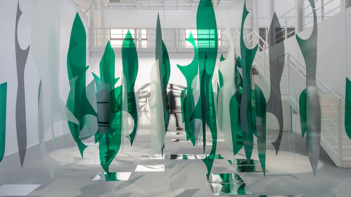
Colour to me is structural, it’s not two-dimensional. The blue of the sky, for instance, is not a colour; it’s a refraction and distribution of light. I use colour in the same way I use light — to enhance materiality, space and contrast. I listen carefully to my client’s experiences with colour because it is a primal factor that everyone has an opinion on and reaction to. Colour is also deeply cultural. Working in so many countries and cultures now, I find its nuances in each place fascinating. With Chromacosm, my solution was a ‘black space’ [black is what you get when you mix all paints] filled with pixels of colour, like some of our ancient tantric paintings.
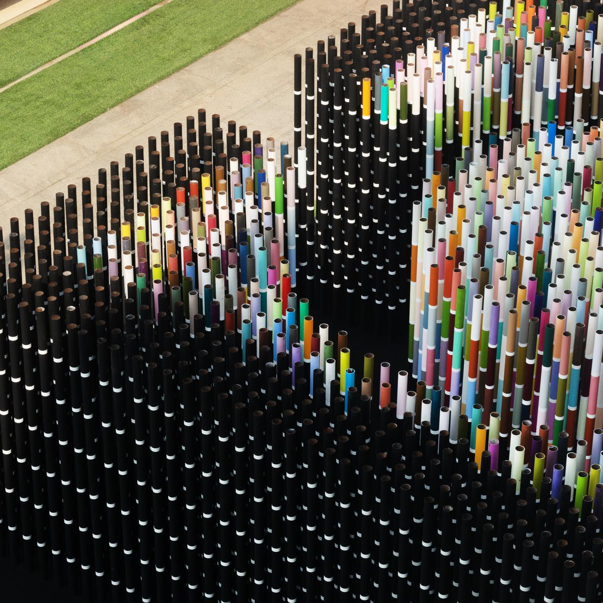
Chromacosm (2024)
| Photo Credit:
Prachi Damle
How does the work of hand and technology reconcile?
Craft and craftsmanship are essential to making our world, whether it’s an app or an age-old handicraft. We need to value both more, particularly in the age of AI. The collective and generational wisdom of craft, especially in countries like India and Japan, is a treasure. I recently launched a collectible furniture line called NINE.5 with Ekaya Banaras. Named for the number of yards in a sari, the lines of the collection mimic the wrapping of the garment around the body. The pattern is a series of zeros; an ode to [mathematician and astronomer] Brahmagupta’s contribution to mathematics in 685 AD, foregrounded and superimposed on a herringbone, a representation of our colonial heritage.
NINE.5 with Ekaya Banaras
| Photo Credit:
Anshika Varma
In interiors and architecture, I find every opportunity to highlight Indian craft, such as [textile label] Morii Design for example, whose work I curated for a show in New York.
How central is neuroaesthetics to your work?
Neuroaesthetics is a multidisciplinary field that focuses on understanding the effects of our environments and experiences on our brains and bodies. My research in this area has affected my approach to everything. My mantra is ‘form follows feeling’, which means that whether I am designing a home, office, institution, or object, my aim is to draw from art and science to create something that makes people feel great, at peace, and grounded.
LOOK HERE (2023)
| Photo Credit:
Chris Coe
In residential projects, I look at how to create spaces for refuge and comfort using information from studies on texture and colour; in spaces for focus or creativity, I curate intentionally proportioned views through windows or images that can help that work. For instance, in the Salt Point house in New York, the top of the windows align with eye level, making it a very intentional viewing into nature. In retail spaces such as the Google store in New York City, all the textures, materials and colours are organised so that the customer can exhale and enjoy wonder and discovery. The floor is soft, and the furniture is made of cork, which mimics the body’s temperature, and minimises experiential friction.
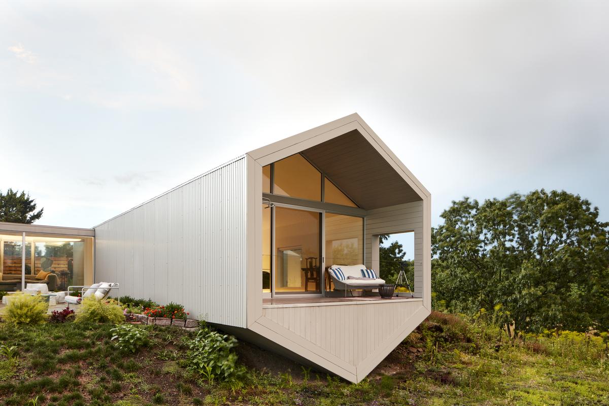
Salt Point house
| Photo Credit:
Ashok Sinha
Are you working on any projects in India?
I am working on two projects, both very different. One is a house for my sister in a village near Tirupati, nestled inside giant rocks, built with local materials and craftsmen. The other, in Hyderabad, is a cultural campus of three buildings with residences and an art gallery, the whole of which is designed as a sculpture. It will feature commissioned artworks by Indian artists in all media. I love working in India, not just because it is home, but because of the way the mix of craft and skilled labour allows me to innovate.
The writer is a lifestyle and arts editor, who launched the Indian edition of Architectural Digest.
Published – August 30, 2025 06:00 am IST


